
After years of watching people paint rooms, I’ve noticed that color selection rarely fails because someone picked an objectively “wrong” shade. It fails because they chose a color in isolation – tested it on a swatch, liked it in the store, brought it home, and then discovered it looked entirely different on their walls. The gap between intention and reality comes down to understanding how light behaves in your specific space and how existing elements influence perception.
The first thing I always tell someone is to stop thinking about paint color as a standalone decision. A color exists only in relation to everything around it. The undertones in your flooring, the finish of your trim, the direction your windows face, the time of day you’re in that room – these aren’t secondary details. They’re the actual conditions that determine how a color will read on your walls.
Light Changes Everything
Natural light is the variable that catches most people off guard. A color that looks warm and inviting in afternoon sun can feel cold and flat on a cloudy morning. North-facing rooms tend to receive cooler, more consistent light throughout the day, which means colors with blue or purple undertones often look better there. South-facing spaces get warmer, more intense light, which can make warm colors feel aggressive and cool colors feel sterile. East and west exposures create their own challenges – morning light and evening light hit the same wall completely differently.
I’ve seen people paint a bedroom a soft gray that looked perfect in the showroom sample, only to find it looked greenish and institutional once it covered all four walls in their north-facing room. The issue wasn’t the gray itself. It was that the undertones in that particular gray (likely a touch of green) became amplified under cool, northern light. In that same room, a gray with warmer undertones – maybe a hint of taupe or beige – would have read much more neutral.
Artificial light matters too, though it’s often overlooked. LED bulbs vary significantly in color temperature. Some run cool and blue, others warm and yellow. If you’re testing paint colors under incandescent or older halogen lighting and then living with cool LED bulbs, the color will shift noticeably. I usually recommend looking at your paint samples at different times of day and under whatever lighting you actually use in that room at night.
What’s Already There Sets the Tone
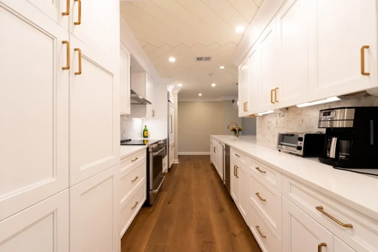
Your existing finishes – wood floors, cabinetry, countertops, tile – act as a color anchor whether you intend them to or not. A warm honey-toned hardwood floor influences how colors on the walls above it will appear. If you’re painting a kitchen and you have medium-brown cabinets, certain paint colors will harmonize with that wood while others will clash or look muddy. This isn’t about following a decorating rule. It’s about optical reality. Colors interact.
I’ve worked in homes where someone picked a beautiful soft blue for the walls, but the undertones in their oak trim made that blue look greenish and sickly. The same blue in a home with white trim would have looked crisp and clean. The paint didn’t change. The context did.
Flooring deserves particular attention because it’s such a large surface area. If you have warm-toned tile or wood, cool paint colors can feel jarring. The reverse is also true – warm paint over cool-toned gray concrete or tile can feel off-balance. This doesn’t mean you have to match everything to your flooring. It means you need to acknowledge the relationship and decide whether you want harmony or intentional contrast.
Purpose and Use Shift Your Priorities
A color choice for a bedroom functions differently than one for a kitchen or bathroom. Bedrooms benefit from colors that feel restful, which usually means lower saturation and softer tones. But “restful” depends on the individual. Some people find pale colors calming; others find them depressing. A muted blue-gray might feel peaceful to one person and cold to another.
Kitchens and bathrooms tend to benefit from colors that feel clean and energizing because these are functional spaces where you’re often doing tasks. That said, an overly bright or saturated color in a small bathroom can feel claustrophobic. I’ve seen people paint a powder room a deep jewel tone thinking it would feel luxurious, only to find it felt like a cave.
High-traffic living areas are where color mistakes become most obvious because you spend so much time there. A color that seemed interesting on a small swatch can feel exhausting when it surrounds you for eight hours a day. This is where testing on a large section of wall – not just a paint chip – actually matters.
The Practical Testing Process
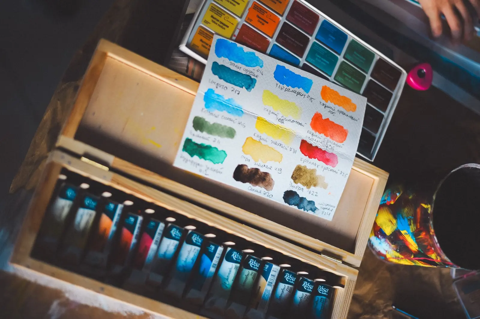
If you’re serious about getting this right, buy sample sizes of paint and apply them to poster board or foam core. Don’t paint directly on your walls yet. Tape these samples to different walls in the room and observe them throughout the day – morning, midday, and evening. Look at them under your actual lighting conditions. Live with them for a few days if possible. This takes longer than picking a color on impulse, but it eliminates most of the regret.
Pay attention to how the color feels against your existing surfaces. Does it complement your flooring or does it create visual tension? Is that tension intentional and desirable, or does it feel wrong? Does the color feel cohesive with the rest of your home, or does it create a jarring shift as you move between rooms?
One thing I’ve learned is that people often underestimate how much surface area matters. A color looks different on a 2-by-3-inch paint chip than it does on an entire wall. The human eye perceives color differently depending on how much of it you’re seeing. A soft taupe that looks elegant on a chip can feel overwhelming when it covers all four walls of a bedroom. This is why sample testing on actual wall space is worth the effort and the small cost.
The colors that tend to work best long-term are those that feel slightly neutral to you – colors you don’t get tired of looking at. This doesn’t mean beige or gray necessarily. It means colors that feel balanced rather than intense or trendy. A warm white with subtle undertones tends to age better than a color that’s very on-trend. That said, if you genuinely love a bold color and you’re willing to repaint when you tire of it, that’s a valid choice too.
What I’ve observed over time is that the best paint color decisions come from understanding your specific light conditions, acknowledging what’s already in the room, and being honest about how you actually use the space. There’s no universally perfect color. There’s only the color that works in your home, under your light, with your existing finishes, for the way you live.